Ever walked into a shop and felt that rush of excitement as you approach the counter, wallet in hand? That’s no accident, my friend. As a retail store owner, I’ve learned that your checkout counter isn’t just a place to ring up sales – it’s your secret weapon for leaving a lasting impression and boosting your bottom line.
In this guide, I’m going to spill the beans on how to turn your retail checkout counter into a money-making machine. We’re talking about designs that’ll have your customers reaching for their credit cards faster than you can say “chip and PIN”. So, buckle up and get ready to transform your cash wrap from a simple transaction point to a profit powerhouse.
- Why Your Retail Checkout Counter Matters More Than You Think
- The Anatomy of a Killer Retail Checkout Counter
- 15 Game-Changing Retail Checkout Counter Ideas
- 1. Prioritise Customer Health and Safety
- 2. Let Customers Browse Digitally
- 3. Engage the Senses
- 4. Impulse Purchase Paradise
- 5. Light It Up
- 6. Bring in the Green
- 7. Screen Time
- 8. Social Media Central
- 9. Tech It Up
- 10. Personal Touch
- 11. Quote of the Day
- 12. Do-Good Corner
- 13. Seasonal Sensations
- 14. Upsell Central
- 15. Data-Driven Design
- Frequently Asked Questions (FAQs) About Retail Checkout Counter Design
- Wrapping Up: Your Retail Checkout Counter Design Checklist
Why Your Retail Checkout Counter Matters More Than You Think
Let’s get real for a second. Your checkout counter is the last thing customers see before they leave your shop. It’s your final chance to make an impact, squeeze in an extra sale, or leave them with a reason to come back. But here’s the kicker – most store owners treat it like an afterthought. Big mistake.
Think about it. You’ve spent all this time and effort getting customers through the door, showing them your amazing products, and convincing them to buy. Why drop the ball at the finish line? A well-designed checkout area can:
- Boost impulse purchases (hello, extra revenue!)
- Improve customer experience (happy customers = repeat customers)
- Reinforce your brand identity (make ’em remember you)
- Streamline operations (less stress for you and your staff)
So, are you ready to give your checkout counter the attention it deserves? Let’s dive in.
The Anatomy of a Killer Retail Checkout Counter
Before we get into the nitty-gritty, let’s break down what makes a checkout counter tick. It’s not just about slapping a till on a table and calling it a day. Here’s what you need to consider:
- Layout: How does it fit in your store? Is it easy for customers to find and approach?
- Design: Does it match your brand aesthetics? Is it functional and appealing?
- Technology: Are you using the right POS system? Is it efficient and user-friendly?
- Display: What products are you showcasing? How are they arranged?
- Customer flow: Can people queue comfortably? Is there enough space for transactions?
Get these elements right, and you’re halfway to checkout counter nirvana. But don’t worry if it sounds overwhelming – we’ll break it all down step by step.
15 Game-Changing Retail Checkout Counter Ideas
Alright, let’s get to the good stuff. Here are 15 ideas that’ll transform your checkout counter from meh to magnificent:
1. Prioritise Customer Health and Safety
Look, I know talking about health and safety isn’t sexy. But in a post-COVID world, it’s non-negotiable. Plus, showing customers you care about their wellbeing? That’s a surefire way to build trust and loyalty.
Here’s how to make your checkout counter a safety haven:
- Pop a hand sanitiser bottle on the counter (bonus points if it’s branded!)
- Install a plexiglass barrier between staff and customers
- Use antimicrobial materials for your counter surface
- Place floor markers for social distancing in queues
Remember, a safe customer is a happy customer. And happy customers spend more. It’s just science, folks.
2. Let Customers Browse Digitally
Ever had a customer ask if you have something in a different colour or size, only to realise it’s not on display? Frustrating, right? Well, here’s a game-changer: bring your e-commerce store to your physical checkout.
Set up a tablet or touchscreen display near your counter. This way, customers can browse your full catalogue while they wait. It’s like having an infinite shelf space without the actual space. Genius, I know.
Pro tip: Train your staff to use these devices to upsell. “Oh, you like that shirt? Let me show you how it looks in blue…”
3. Engage the Senses
Who says shopping is just a visual experience? Let’s get all the senses involved, shall we?
Near your checkout, try:
- Placing scented candles or diffusers (nothing too strong, mind you)
- Offering small, individually wrapped sweets
- Playing soft, ambient music
The goal? Create a multi-sensory experience that makes waiting in line actually enjoyable. I once saw a friend who added a small chocolate fountain near his checkout. Sales went up 15% that month. Coincidence? I think not.
4. Impulse Purchase Paradise
Ah, impulse purchases. The unsung heroes of retail profit margins. Your checkout area is prime real estate for these little money-makers. But here’s the catch – you need to be strategic about it.
Some ideas for impulse-worthy items:
- Travel-sized versions of popular products
- Seasonal items (think holiday-themed socks or accessories)
- Complementary products (phone chargers near the electronics, anyone?)
- Gift cards (perfect for the “I forgot a birthday” crowd)
Remember, the key is to keep these items low-cost and high-margin. Your customers should think, “Oh, why not?” not “Do I really need this?”
5. Light It Up
Lighting can make or break your checkout area. Too dim, and customers might miss your carefully curated impulse buys. Too bright, and it feels like an interrogation room.
The sweet spot? Warm, inviting lighting that highlights your products without being harsh. Consider:
- LED strip lights under the counter for a modern look
- Spotlights on key product displays
- A statement light fixture that matches your brand vibe
We once installed colour-changing LED lights in our partner store’s checkout area. Not only did it look cool, but we could change the mood for different seasons or events. Talk about versatile!
6. Bring in the Green
No, I’m not talking about money (though that’s nice too). I’m talking about plants. Adding a bit of greenery to your checkout area can work wonders:
- It creates a calming atmosphere (handy for impatient customers)
- It improves air quality (always a plus)
- It adds a touch of life to what could be a sterile space
Go for low-maintenance options like succulents or snake plants. They’re hard to kill and look great with minimal effort. Plus, they’re great conversation starters. “Oh, you like the plant? Let me tell you about our eco-friendly initiatives…”
7. Screen Time
A TV screen behind your counter isn’t just for fancy boutiques anymore. It’s a powerful tool for engaging customers and boosting sales. Here’s how to use it effectively:
- Showcase your latest products or collections
- Display customer testimonials or user-generated content
- Share your brand story or behind-the-scenes footage
- Advertise upcoming sales or events
The key is to keep the content fresh and relevant. No one wants to watch the same 30-second loop for their entire wait time.
8. Social Media Central
In today’s digital age, every customer is a potential brand ambassador. Why not encourage them to spread the word right from your checkout?
Create a dedicated ‘social media zone’ near your counter:
- Display your brand hashtags and social media handles
- Set up a photo-worthy backdrop or prop station
- Offer a small discount for customers who post about their purchase
I’ve seen once a ‘selfie mirror’ set up near a checkout with a hashtag etched onto it. User-generated content increased by 200% that month. Talk about free marketing!
9. Tech It Up
Your POS system is the heart of your checkout area. It needs to be sleek, efficient, and packed with features. But here’s the thing – it should also look good.
Invest in a modern, tablet-based POS system that:
- Processes transactions quickly
- Integrates with your inventory management
- Collects customer data for marketing
- Looks stylish on your counter
Remember, the goal is to make the checkout process as smooth as possible. The less time customers spend waiting, the more likely they are to come back.
10. Personal Touch
Your checkout counter is a great place to show off your brand personality. Don’t be afraid to add a bit of ‘you’ to the mix:
- Display photos of your team or your store’s history
- Share customer success stories or testimonials
- Show off any awards or press mentions
This personal touch helps create an emotional connection with your customers. And let’s face it, emotion drives purchases more than logic ever will.
11. Quote of the Day
A little humour goes a long way in retail. Why not add a witty quote or pun to your checkout area? It could be related to your products, your brand, or just something to make customers smile.
For example, if you run a plant shop, you could have a sign saying, “Let’s root for each other and watch each other grow!” Cheesy? Maybe. Memorable? Absolutely.
12. Do-Good Corner
Consumers today care about more than just products – they want to support brands that make a difference. Use your checkout area to showcase your corporate social responsibility efforts:
- Display information about charities you support
- Show the impact of customer purchases on your initiatives
- Offer customers the option to round up their purchase for charity
Not only does this make customers feel good about their purchase, but it also builds brand loyalty. Win-win!
13. Seasonal Sensations
Keep your checkout area fresh by updating it with the seasons. This could be as simple as changing the colour scheme or as elaborate as a full thematic overhaul.
Some ideas:
- Add festive decorations during holidays
- Showcase season-specific products
- Change your scents or music to match the time of year
This not only keeps things interesting for regular customers but also creates a sense of urgency. “Better buy now, this won’t be here next month!”
14. Upsell Central
Your checkout area is the perfect place for some strategic upselling and cross-selling. The key is to make it feel helpful, not pushy.
Try these tactics:
- Display complementary products near related items
- Offer bundle deals at the point of purchase
- Train staff to suggest add-ons based on customer purchases
Remember, the goal is to increase the average transaction value while still providing value to the customer.
15. Data-Driven Design
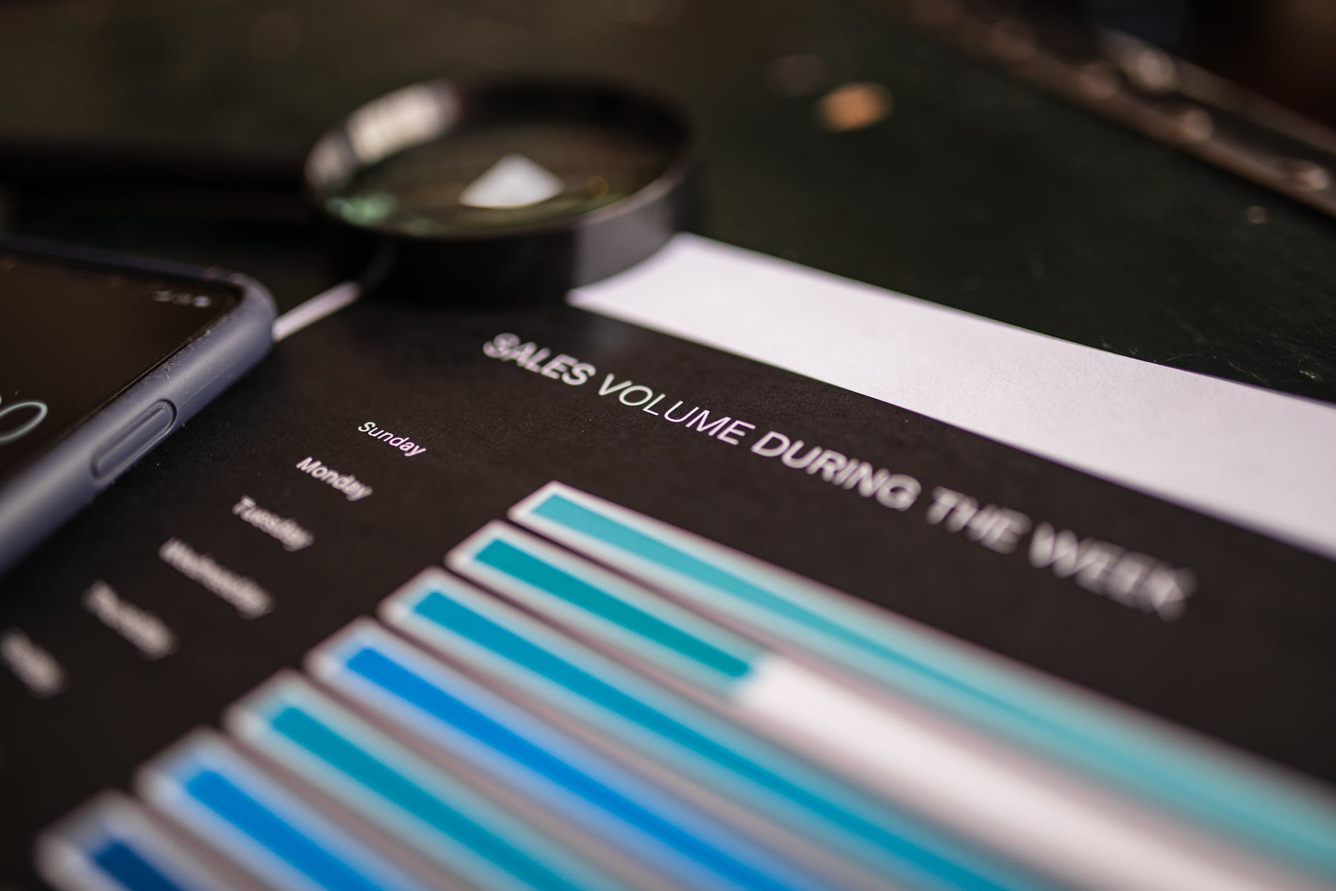
Last but not least, let data guide your checkout counter design. Use your POS system to track which products sell best at the counter, which displays get the most attention, and how different layouts affect sales.
Don’t be afraid to experiment and iterate based on what the numbers tell you. What works for one store might not work for another, so find your own winning formula.
Frequently Asked Questions (FAQs) About Retail Checkout Counter Design
How much space should I allocate for my checkout area?
As a rule of thumb, allocate about 10-15% of your total store space for the checkout area. This includes space for queuing, the counter itself, and any displays or impulse buy sections.
Should I have multiple checkout counters?
It depends on your store size and typical customer volume. If you often have long queues, consider adding more counters or mobile POS systems for busy periods.
How can I make my checkout counter more accessible?
Ensure there’s enough space for wheelchair users to manoeuvre, keep the counter at a comfortable height for all users, and consider adding a lower section for accessibility.
What’s the best material for a checkout counter?
Durability is key. Materials like laminate, solid surface, or even stainless steel are popular choices. The best option depends on your store’s aesthetics and budget.
How can I reduce theft at the checkout?
Use security mirrors or cameras, keep high-value items behind the counter, and train staff on loss prevention techniques.
Wrapping Up: Your Retail Checkout Counter Design Checklist
Phew! We’ve covered a lot of ground, haven’t we? Let’s recap the key points to consider when designing your retail checkout counter:
- Prioritise safety and hygiene
- Integrate digital browsing options
- Engage multiple senses
- Strategically place impulse buy items
- Use effective lighting
- Add a touch of nature
- Incorporate digital screens
- Encourage social media engagement
- Invest in a modern POS system
- Add personal touches
- Use humour and wit
- Showcase your social responsibility
- Keep it seasonal
- Master the art of upselling
- Let data guide your decisions
Remember, your retail checkout counter is more than just a place to process transactions. It’s your last chance to make an impression, boost sales, and leave customers excited to come back.
So, go ahead and give your checkout area the attention it deserves. Trust me, your bottom line will thank you. And who knows? You might just find that designing your perfect checkout counter is as fun as it is profitable.
Now, off you go. You’ve got a retail checkout counter to revolutionise!


